Iguana – Pages & Profiles
1 Introduction
1.1 The building blocks of an Iguana site
The main building blocks of an Iguana site are:
· the site profile: this corresponds more or less to a website; each profile can be seen as a separate website and holds all the properties that are specific for that website
· the location profile: the location profile is a specific profile that sits on top of a site profile; it holds a limited set of properties that are specific for a location (such a location can be seen as a physical building, so the location profile holds the settings that are relevant for the website of a specific branch of an organization or shop)
· the view (page): a view is a combination of a set of applications; in a traditional website the view is in fact a "page" that groups one or more widgets (see below); although you can think of a view as a page, it is in fact a more generic principle that groups a number of applications together for display purposes
· the application: an application is a small piece of information that holds content such as an RSS feed, a word cloud, a text-item, a blog entry, a news article, etc.
· the Short URL: a short, user-friendly URL that can be created to make access more user-friendly and can also help to improve SEO (Search Engine Optimization); a Short URL can combine a site profile, a location profile and a page.
These concepts are the most important building blocks of any Iguana site. The actual presentation of the data depends on multiple related settings, such as:
· theme (skin)
· navigation menu
· the widget: a widget is the front-end placeholder for content; a widget is the visual representation of an application in the front-end framework
· user-agent and accessibility settings
· language settings.
The display settings are described in the Structure and Style document.
At storage level, the relationships between these concepts are kept as flexible as possible. The goal is to have -at storage level- as little as possible dependencies between the different elements, which improves flexibility when editing and structuring your content. This implies e.g.
· a page can be linked to multiple site profiles
· an application can be used in multiple pages
· a navigation menu can be linked to multiple site profiles and can be used in multiple applications (it can e.g. be embedded in a Rich Text Item (RTI))
· a theme can be linked to multiple site profiles
· pages can be displayed differently according to [a] user agent, [b] accessibility options and [c] preferred settings (these elements will be described later in this documentation)
After selecting the Pages & Profiles option from the Navigation pane on the left, this section will be expanded to show the menu:

2 Site profiles
2.1 Introduction
A single Iguana installation can support one or more so-called "site profiles". A site profile can be considered as a separate website, or as a section within a single website.
Each site profile has a number of basic parameters that determine the content, structure and look & feel of the site. The basic parameters are, amongst others, the site sections (that determine the structure of the site and the pages), a theme (which only serves as a default), a main navigation menu, etc.
Views (pages) are linked to site profiles. They are however not “part” of it, i.e. the page does not “belong” to a (single) site profile. If you call a page without a site profile it will use the default site profile. So, pages are shown using a chosen, the active or the default site profile (in this order depending on what is available).
A site profile is the main element that determines the structure of the site (and as a consequence of the pages). A site profile is always linked to a theme (a CSS file), which determines the actual visualization of the site.
A site profile has one set of “sections” (which determine e.g. whether there is a header or a footer, what the location of the site navigation menu is, etc.) but can have multiple themes. A site profile has one (or no) main navigation menu.
A site profile can be used via multiple user-agents (e.g. on a desktop PC versus on a Smartphone).
A profile can be used with multiple usability/accessibility settings. This implies that the same profile can be used with multiple “user-agents”, i.e. the same profile can be used on a desktop/laptop and on a Smartphone. Iguana will automatically adjust a number of settings based on the “user-agent”.
A profile can be used with multiple “location settings”, i.e. in combination with multiple Location profiles.
2.2 Profiles overview
If you select the Site profiles option from the navigation menu, the list of existing profile instances is displayed. This display uses a generic element in the Iguana CMS, - the overview page of instances of a specific data type.

The Site profile instances overview page is described in the chapter Instances overview page of the "Management common workflow" document.
The options on the Site profile instances overview page are described in the chapter Options on the instances overview page of the "Management common workflow" document.
2.3 How to create a new site profile
To create a new profile, act as follows.
1. In the left pane, click on the Site profiles link, which can be found under the “Pages & profiles” header.

2. On the overview screen of existing profiles, click on the button.
3. A new page is opened, allowing you to define all properties of the new profile. Define all settings for the new profile.
4. Click on the button to save your work.
5. If you want the profile to be actually usable (accessible) for users, you need to validate it for production. Click on the button.
2.4 Profile property overview & options
The properties of site profiles are ordered in a number of so-called property groups, which are sections on the page. The property groups are:
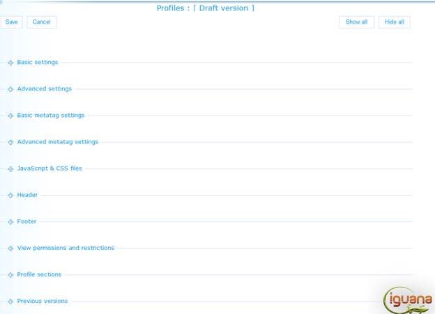
Each of these property groups forms a separate section on the Profile details page. Each section can be collapsed or expanded by clicking on its title. The and buttons can be used to expand or collapse all sections.
2.4.1 Basic settings
The basic settings of profiles are:

Define the basic settings as follows:
In use: You can set a profile to Not in use. If a profile that has the In use property set to No is accessed, Iguana will display a message indicating that the site is not available. This message will contain a hyperlink to the home page of the default site profile. The user can click on the hyperlink to navigate to that page. The checkbox is disabled for the default profile (you cannot uncheck it), i.e. you cannot set the default profile to Not in use.
Accessibility features: If you set this value to Yes, a number of Iguana features will behave differently and some features will be positioned in a different location on the page. This is all done to improve accessibility for visually impaired users. Please see the chapter Accessibility features per profile in the document on Accessibility for more information on the effects of this setting.
Identifier: This is the readable identifier of the site profile. This is used only in the CMS. If a reference to the profile is included in a URL, you should not use the Identifier, but the profile's UUID (which is displayed in the Advanced Settings section)..
Favicon: You can attribute a favicon to the site. See http://en.wikipedia.org/wiki/Favicon for more information on favicons. You can use the button to select a favicon; using this option will open Iguana's Media Manager and you can now select the favicon image. Please note that this must be an image of the type .ico.
Page title (English): The (language dependant) title of the page (which is placed in the HTML <title> tag). This is either a text (e.g. “Home page”, or “News page”) or a so-called “substitution string”. Substitution strings are described in the next section.
Substitution strings as Page title
You can use so-called “substitution strings” as Page title. Substitution strings are tokens that, in the actual Iguana front-end, will be replaced by “real” data.
The notation [[txt:id:application:language:module]] is used for so-called ‘substitution strings' or ‘tokens'. These are pieces of text that can be replaced by other pieces of text. This means that everything starting from [[ and ending with ]] will be replaced by a different text. It is for instance used to insert a text that has been defined within the System texts module in the CMS. This notation is defined as follows:
· txt: tells the responsible script that this substitution string will be replaced by a text defined in the System texts module.
· id: the corresponding value of Id in the System texts module.
· application: not used at the moment, always leave empty or use ‘*' (without quotes). Optional, if not supplied, ‘*' is used.
· language: language for which the text should be retrieved. Please note, this is the 3-letter language code (in lowercase), e.g. ‘eng' (and not ‘English'). Optionally, if not supplied, the currently defined language is used.
· module: this is the module for which the text is defined. Please note: this is the system code used for the module, which is displayed when selecting the desired text inside the CMS in the left hand input field for ‘Module'. Optionally, if not used, module ‘*' is used.
Keep in mind, the order of the optional settings is important. This means, if application is left out, neither language nor module can be supplied. So the valid ways of using this substitution string are:
[[txt:id]]
[[txt:id:application]]
[[txt:id:application:language]]
[[txt:id:application:language:module]]
Example: The substitution string [[txt:title::dut:meta]] will be replaced by the Dutch text which has as Id ‘title' and which is defined in the ‘Meta tags' module.
2.4.2 Advanced settings
The advanced settings of profiles are:

Define the advanced settings as follows:
Created by: This is the person who created the Site profile and the date on which it was created. You cannot modify these properties.
Modified by: This is the person who last edited the Site profile and the date on which it was modified. You cannot modify these properties. Only visible when updating an existing definition, not present on the form for defining a new profile.
Unique id: This is the unique id of the Site profile. You cannot modify it.
Doctype: The Doctype (see e.g. http://en.wikipedia.org/wiki/Document_Type_Declaration) is used to indicate which HTML version is used. This is primarily relevant for the interpretation and support of CSS. In principle you should never change these settings; changing them can have very big effects on your site and cause it to no longer function correctly.
Theme: The theme is the active CSS file that should be used on the page. See the document on Structure & style for an overview of the standard Iguana styles. Obviously, you can have your own themes (CSS files).
Banner: You can define if a banner needs to be included in the content section of the page. This is a default banner for the site, that can be inherited on each page, or can be overruled by a page-specific banner. You can choose from the following options:
· None: no default banner is defined
· Image: an image is included as the default page banner for pages using this profile; you can use the button to select an image; this option will open Iguana's Media Manager.
Please note that you cannot use an animation as the default banner. At page level, you can however use a page-specific animation in the banner.
After you have selected an image it will appear in the text box in its “URL encoded” version (e.g. blanks may appear as %20 in the URL). Please do not create very large banner images, as they will slow down the page load process.
Bodytag attribute: The Bodytag attribute can be used to define: (a) the general classes that should be used on the page; (b) the theme; (c) the font size, and (d) the indication whether or not the context is mobile or not. In principle these settings should never be changed.
Institution/location scope: This is to support a hierarchical level for a number of functionalities, like search, interests, reservations, featured items etc.
The default for this field is “All”. But you can select a specific institution from the dropdown list OR an institution/location combination.
The scope setting is applied to the following areas:
· If the full database is searched (not a partial index) then highlight the documents that have items within the defined scope
· Limit display of featured items in bookrivers, etc. to documents within the defined scope
· Limit available interests to the defined scope; note that this requires different tree-id sections in the spreadsheet, where the tree-id is InterestsGrownups_institutioncode, e.g. “InterestsGrownups_LIBWEST”
· Limit RSS interests feed to the defined scope
· Use the linked WebOpac profile for reservations, but if there is a WebOpac profile with id SYSRES, retry a reservation at the SYSRES profile level if the one at the scope level fails (in other words, try to reserve within the institution scope first, and try the global scope if that fails)
JavaScript textblock: This contains the start-up script that is executed on each Iguana page in this site profile. This is mandatory and should not be modified without consulting Infor.
2.4.3 Basic metatag settings
The basic metatag settings of profiles are:

The metatag settings are included into a page as metatags (see e.g. http://en.wikipedia.org/wiki/Meta_element). An example of the end result in the HTML page is code such as <META NAME='keywords' CONTENT='libraries, archives, historic buildings' />. Metatags have multiple functions. In essence they provide structured metadata about the page that is not directly displayed to the user that is accessing the page. Metatags also play a role in the context of SEO (Search Engine Optimisation).
Define the basic metatag settings as follows. (Note: not all possible values for each property are listed, - these are standard HTML properties and detailed information can be found on the internet.)
Characterset: The character set that is used.
Robots: There are two generic robots metatag settings:
· Noindex : if set to Yes, the page will not be indexed by Search Engine crawlers
· Nofollow : if set to Yes, Search Engine crawlers will not follow the links on this page (and as a result of that not navigate to those pages); please note that these settings refer to static content and not to content from the bibliographic or other metadata databases; [typically, we would expect that crawlers would not crawl these databases, but each Search Engine may handle these differently].
Author: The author of the page.
Keywords (English): The keywords that should be inserted into the page. Multiple keywords are entered as semi-colon delimited.
Description (English): A description of the page. (This is included in the HTML page as “meta name='description'”, e.g. <meta name="description" content="Information on library opening loans and returns." />).
Examples
|
Property |
Example value |
Inserted in HTML page as |
|
Characterset |
UTF-8 |
<META HTTP-EQUIV='content-type' CONTENT='charset=UTF-8' /> |
|
Robots : Noindex |
Yes (checked) |
<META NAME='robots' CONTENT='noindex' /> |
|
Robots : Nofollow |
Yes (checked) |
<META NAME='robots' CONTENT='nofollow' /> |
|
Author |
Tiffany, Tiffany@TheCompany.com |
<META NAME='author' CONTENT='Tiffany, Tiffany@TheCompany.com' /> |
|
Keywords |
drawings; design |
<META NAME='keywords' CONTENT='drawings; design' /> |
|
Description |
|
|
2.4.4 Advanced metatag settings
You can add any number of metatag properties to a site profile. Each of these has the following properties:

The advanced metatag settings can be used to define additional metatags. In principle you would not or only very rarely define such additional metatag settings. An example could be that you use the advanced metatag settings to define Search Engine specific metatags (the metatags that are mentioned in the Basic metatag settings sections are generic to all search engines; some search engines support additional metatag settings, e.g. Google's ‘nosnippet').
Define these properties as follows.
Metatag type: The metatag type is either ‘http-equiv' or ‘name'.
Metatag name: The name of the metatag (see below for an example).
Metatag content: The ‘value' that is associated with the metatag name (see below for an example).
An example of an advanced metadata tag setting is:
<META name="googlebot" content="NOARCHIVE, NOODP, NOSNIPPET" />
This would be defined as Metatag type = ‘name', Metatag name = ‘googlebot' and Metatag content = ‘NOARCHIVE, NOODP, NOSNIPPET'.
Use the button in the Advanced metatag settings section to add additional advanced metatag properties.
You can remove properties by clicking on the icon at the end of each row in the list of properties.
(Note: not all possible values for each property are listed, - these are standard HTML properties and detailed information can be found on the internet.)
2.4.5 JavaScript & CSS files
You can add any number of properties that are related to JavaScript & CSS files to a site profile. Each of these has the following properties:

These settings are used to define the links to JavaScript and CSS files that are used within the site. Define these properties as follows.
Type: The type is either ‘js' (JavaScript) or ‘css' (CSS).
File: The file is a reference to a JavaScript or CSS file. This is either a hard-coded link that includes the full server and path names, or a link that contains a logical reference to the server and path. These logical references (or substitution strings) have the following syntax:
· You can refer to the JavaScript server and path by including ‘[[txt:jsdir]]' at the beginning of the file name (e.g. [[txt:jsdir]]swfobject.js)..
· You can refer to the CSS server and path by including ‘[[txt:cssdir]]' at the beginning of the file name (e.g. [[txt:cssdir]]base.css).
· You may see ‘[[fnc:function]]' notations in the file names, in which the function is a specific server-side function. You should never change these, as they may cause the site to malfunction.
Additional attributes: Additional attributes can be linked to a JavaScript file. These attributes can be specific for an individual file. The syntax to define these additional attributes is: variable = variable value. Both Variable and Variable value are specific for individual JavaScript files. A typical usage of this is e.g. if one wants to load custom JavaScript from an external file, - and the provider of the file requires the usage of additional attributes. The JavaScript library will then search for this tag in the HTML.
|
|
All these properties are used in rare circumstances and you should never change these settings. Changing these settings can result in non-working pages. In very rare circumstances it can be relevant or necessary to add references to additional JavaScript or CSS files. |
Use the button in the JavaScript & CSS files settings section to add additional advanced JavaScript or CSS files.
You can remove files by clicking on the icon at the end of each row in the list of properties.
2.4.6 Page header & footer
[ This section discusses both the Page header and Page footer. ]
The Header and Footer are defined as a Rich Text Item.
The Header and Footer sections each contain the Rich Text Editor that allows you to define the Header or Footer section content (as a Rich Text Item).
Rich Text Items are described in the chapter Rich Text Items (RTI's) in the Applications document. We refer to that section for all details of RTI's.
You can add specific Iguana elements in the Header or Footer via the RTE. These are:
|
|
The RTE button bar contains a button that allows you to insert a navigation menu. If you click this button, a popup will appear that allows you to define two properties. Navigation : You can select the navigation menu that you want to insert by selecting it from the list of available navigation menus. Application : The application selected determines the logic behind it. |
|
|
The RTE button bar contains a button that allows you to insert a Search Box into a header or footer. More information on Search Boxes can be found in the chapter on Search. |
[ These elements can be added to any Rich Text Item (RTI), not just to Header or Footer RTI's. ]
2.4.7 View permissions and restrictions
View permissions and restrictions can be used to restrict access to a profile for specific periods, users or devices.
This is described in the chapter Generic instance properties of the "Management common workflow" document.
2.4.8 Profile sections
Profile sections are described in section 2.5 below.
2.4.9 Previous versions
Iguana will store up to ten previous versions, which are displayed in the Previous versions property section. The previous versions can be invoked by clicking on them.
If a Previous version is selected, it can be saved as the current version by clicking on the button.
2.5 Profile sections: how to define the layout of a site
The Profile sections are used to define the generic layout of a site. On top of these settings, each individual page in the site will have its own Layout settings. The combination of the Profile sections at Site profile level and the Layout settings at Page level determine the layout of individual pages.
The Profile sections are used to define the presence and position of the following ‘sections':
· header
· navigation
· banner
· content
· footer
For each of these sections you can define (a) whether or not they are included in the site profile's layout, and (b) their position on the page.
If all sections are included, this typically leads to a site structure as follows:

Note
You must save the initial definition of your profile, before the Edit icon will appear.
The layout of the content section is defined for each individual page.
2.5.1 How to position sections
The Profile sections are grouped in two categories:
· profile sections in use
· profile sections not in use
You can drag and drop sections to and from these categories by grabbing the  icon of a section. Sections that are dragged to the ‘profile sections not in use' will not be included on the page.
Within the ‘profile sections in use' you can position sections by using the same icon. This allows you to drag and drop the sections to the position you want them to be.
Please note
|
|
The section ‘names' have no relationship to their location, which implies e.g. that you can drag the ‘header' section to the bottom, and the ‘footer' section to the top. Obviously, it is highly confusing to do so, and we advise you to avoid such configurations. |
2.5.2 How to define the ‘content' of sections
You can define the ‘content' of the “Navigation” and “Content” sections by clicking on the  icon of the section. This will open a dialogue that is specific for those sections.
The content of the other sections is defined differently, as described in the following table.
|
Section |
Dialogue |
|
Header |
The page header is defined “in” the Page overview, in the section . |
|
Navigation |
This will open a dialogue that allows you to select the main navigation menu. |
|
Banner |
You can define the default banner for the site in the section of the site profile. |
|
Content |
This will open a dialogue that allows you to position widgets that have a fixed location throughout the whole site. This is described in detail in the next section of this chapter. Please note that you cannot define the actual content of this section in the site profile. The actual content is defined for each individual page. |
|
Footer |
The page footer is defined “in” the Page overview, in the section . |
2.5.3 Defining the content of the Header and Footer sections
The content of the Header and Footer sections is defined for the profile. This is done via the and is described in the section on and .
2.5.4 Defining the content of the Navigation section
If you click on the icon in the Navigation section, a popup page will be opened. The popup will show:

for a new definition, and for an exiting definition it will additionally show the current navigation:

To remove the current navigation menu:
1. Click on the button. This does not actually delete the navigation menu, but only removes it from the navigation section of the profile. (If you want to delete the navigation menu itself, you need to detach it from all profiles to which it is linked, and then delete it in the management of menus.)
2. A warning message is shown: ‘The navigation will be deleted from the profile after saving the profile'. Click on the button to close the message. The popup will be closed.
3. To save the change, click the button on the overview page of the Site profile.
To replace the current navigation menu (or to add a navigation menu for the first time):
1. Click on the navigation menu that you want to add to the navigation section of the profile. (If there is already a navigation menu attached to the navigation section, the one you select will replace the existing one.)
2. An Edit navigation settings page is displayed. Click the button to add the navigation menu to the navigation section of the profile.
3. A warning message is shown: ‘The navigation will be added to the profile after saving the profile.' Click on the button to close the message. The popup will be closed.
4. To save the change, click the button on the overview page of the Site profile.
You cannot create a new navigation menu as part of the process of defining page settings. The navigation menu needs to be created in the management of menus.
2.5.5 The ‘content' section and ‘fixed widgets'
When looking at a specific page in a site, the content section is the most important section on the page, as it is the container of the page's specific content. While footer, header and navigation menu are not page-specific, the content section by default is. As such, the actual content of a page is not defined at site profile level, but at page level.
Nonetheless, you can place applications in the content section at profile level. In some cases, you may require that specific applications (widgets) are always at the same location on each page. In such a case, it would be impractical to position those widgets on each and every page.
The content section edit feature may be used to position applications (widgets) in specific regions of the content section. These applications (widgets) will then appear on each page in the site. A typical example of such a ‘fixed' widget is a ‘Quick Menu' that appears at the top right of the content section of each page in the site.
You can place the applications (widgets) in four regions of the content section:
· top left
· top right
· bottom left
· bottom right
These regions are marked in the following screen shot with the dotted lines in the content section.

|
|
The actual location on each page also depends on the layout of the pages however. Iguana will place them as close as possible to the preferred location. |
To add an application to a fixed region of the content section, proceed as follows.
1. In the Content section, click on the icon.

2. This will open the application selector. This is a treeview that allows you to browse the list of existing applications. You can browse the list of applications and select the one you want to add to the page by clicking on it.
3. An "Edit application settings" page is displayed and you can define properties related to the application.

· The Appearance of application property allows you to select from three possible options: Regular, No title bar and Hidden title bar. The option ‘Regular' means that this application will be displayed including the title bar. The option ‘Hidden title bar' means that this application will be displayed with an invisible title bar. However, when the mouse is hovered over the application, the title bar will be shown. When the mouse is moved away from the application again, the title bar will be hidden again. The option ‘No title bar' means that this application will be displayed without a title bar. However, when a user who has moderator rights is logged on, the application and title bar will act as if it was set to ‘Hidden title bar', so the title bar will be shown when the mouse is hovered over the application.
· The Custom class property allows you to define a custom CSS class for the application. This class name is then attached to the container (the widget) of the selected application. The settings for this class need to be defined in the linked CSS file. (See next section for an example of a custom class.)
· You can also define the Region in which the application needs to be positioned: this is either Top left, Bottom left, Top right or Bottom right.
· You can also define which pages this application will not be placed on, - the Exceptionlist. Select the appropriate pages from the list and move them to the right-hand box.
4. Click on the button to add the selected application to the content section.
5. A confirmation message is displayed: ‘The application has been added. The position of the application can be adjusted in the preview window if necessary.' Click to proceed.
6. If needed, you can move applications to a higher or lower ranking in the region it is located at by clicking on the  icon (to a lower ranking) or the
  icon (to a higher ranking). If you want to remove an application from the region, you can click on the
  icon.
icon.
7. Click on the (or ) button to store the new settings.
2.5.6 ‘Fixed widgets' and custom classes
The next screen shot shows an example of the usage of a custom class.

The page contains a ‘fixed widget', - the widget that is in the top right region of the content section (below the banner). The widget has a custom class, which is why it stands out from all the other ones (it has a white and orange font on a grey background, - in contrast with all the other ones).
3 Views (pages)
3.1 Introduction
A view is a combination of a set of applications. In a traditional website the view is in fact a "page" that groups one or more widgets (applications). Although you can think of a view as a page, it is in fact a more generic principle that groups a number of applications together for display purposes. Think of a home page (the view) that contains a number of applications: a calendar, a search box, a Google Maps mashup, a Rich Text Item, a Twitter feeds mashup, a navigation menu, etc. These “applications” are represented as widgets in the Iguana front-end.
As said: although a view is a more generic principle than a page, they will be treated as synonyms in the context of this section.
The structure and look and feel of a page are defined by a number of elements. The most important ones are:
· The sections that are defined in a site profile determine the overall layout of the page (position / usage of a header, navigation, footer, banner, content section, etc.).
· The applications on the page are structured according to a chosen layout template (which in its simplest form is a set of "columns" on the page). The layout/position of the application widgets can be defined. This layout template is actually the content of the “Content” section (as defined in the Sections of the Site profile).
· The theme (the CSS) will determine the actual “style” of the page (fonts, colours, etc.)
Content can be added to a page in any random order or combination.
3.2 Inline editing
Editing pages is supported in two different environments. Obviously, pages can be edited via the CMS, which is described elsewhere in this document. There is however a second way to edit pages, - via the actual front-end website. This so-called inline editing implies that you have the necessary rights to edit pages and that you are logged on. You can then perform a number of edit functions such as adding content to pages or editing applications (widgets). You cannot create new pages or delete existing pages via inline editing.
To use the inline editing functions, act as follows:
1. In the Iguana front-end (i.e. not in the CMS), log on using the standard logon facilities. The user id that you use to log on MUST be linked to CMS user credentials that have the correct authorisation to edit pages.
2. Access the page that you want to edit.
3. Proceed as described below, depending on whether you want to add content to a page or edit an existing application.
3.2.1 Inline editing : add content to a page
You cannot add content to a page in Inline editing. This needs to be done via the Iguana CMS.
3.2.2 Inline editing : edit an existing application (widget)
To edit an existing application (widget), you can click on the icon that appears in the widget's header (when you are logged on with the correct authorisation rights).
This icon does not appear if you are not logged on or if you do not have the correct authorisation rights.
Once you have clicked on the icon, the CMS will be opened as a popup. You can now make the necessary changes. Once you have clicked on the button in the CMS, your changes will be saved and the popup will be closed.
3.2.3 Inline editing : remove an existing application (widget)
To remove an existing application (widget), you can click on the icon that appears in the widget's header (when you are logged on with the correct authorisation rights).
This icon does not appear if you are not logged on or if you do not have the correct authorisation rights.
After you have deleted one or more widgets from the page, you need to store the new layout as follows:
1. If you are logged on and if you have the right authorization to make changes to the page, you will notice that there is a small icon (  ) at the top right of the page. If you move your mouse over this icon, a option will appear.
2. Click the option.
The new layout will now be saved and a confirmation message is displayed.
|
|
Please note that this option does not actually delete the application, - it removes it from the page you are working with. |
3.2.4 Inline editing : move content to a different location
To move content (widgets) to a different location on a page, you can drag the widget by its title bar to another location. When you hover over the widget's title bar, you will notice that the cursor changes to the operating system's standard move cursor ( ). This indicates that you can drag the widget to another location.
If a widget has a hidden title bar, it will be shown if you hover your mouse over the widget.
This icon does not appear if you are not logged on or if you do not have the correct authorisation rights.
After you have moved one or more widgets to their new location, you need to store the new layout as follows:
1. If you are logged on and if you have the right authorization to make changes to the page, you will notice that there is a small icon ( ) at the top right of the page. If you move your mouse over this icon, a option will appear.
2. Click the Save layout option.
The new layout will now be saved and a confirmation message is displayed.
3.3 Pages overview
[The previous section discussed Inline editing, i.e. editing pages starting from the front-end. The next sections describe how you create and edit pages in the CMS.]
If you select the Pages option from the navigation menu, the list of existing page instances is displayed. This display uses a generic element in the Iguana CMS, - the overview page of instances of a specific data type.

The Page instances overview page is described in the chapter Instances overview page of the "Management common workflow" document.
The options on the Page instances overview page are described in the chapter Options on the instances overview page of the "Management common workflow" document.
3.4 How to create a new page
To create a new page, act as follows.
1. In the left pane, click on the Pages link, which can be found under the “Pages & profiles” header.

2. On the overview screen of existing pages, click on the button.
3. You will now be offered to enter the properties for the new page. The most vital properties that need to be defined are related to the content on and layout of the page.
4. Add content to the page by copying applications to it.
5. Place the applications on the location you want them to be.
6. Click on the button to save your work.
All steps in this process are described in detail in upcoming sections of this document.
3.5 Pages property overview & options
The properties of pages are ordered in a number of so-called property groups, which are section on the page. The property groups are:

Each of these property groups forms a separate section on the Page details page. Each section can be collapsed or expanded by clicking on its title. The and buttons can be used to expand or collapse all sections.
3.6 How to define the layout of a page: templates
The page layout is determined by the combination of
the site profile sections + the page layout + CSS.
The site profile section definitions determine, for the whole site, which sections are present on a page. This is the site's highest level structure and determines if there is a footer, a header, a navigation menu, etc., - and if so, what the content and layout of all these sections are. This is described in detail in section 2.5 of this document.
The actual layout of the content section of a page is determined by the page layout, which is a layout template that determines how many columns or areas are on the page, and where they are placed. Each of these columns or areas is in fact a container in which you can place content (in the form of widgets).
The page banner (an image or an animation) is not defined in the page layout template, but under the page's Basic settings.
What the elements on the page actually look like is determined by the CSS file that is used to actually render the page. See the chapter Themes : using CSS to style your site in the Structure & Style document for a description of how this works.
Please note that a page does not inherit its layout from the site profile. Because a page can be used in multiple profiles, this would result in irresolvable conflicts if the profiles' default layout would differ fundamentally. Although a page does not inherit its layout from the site profile, the profile does determine which sections are used and in what order. The view (the page) determines the layout and content of the “Content” section.
This section of the documentation describes in detail how templates can be used to structure the content on a page.
3.6.1 Available templates
The following layout templates are available.
|
Basic1 |
1 column |
|
|
Basic2 |
2 columns with relative width |
|
|
Basic3 |
3 columns with relative width |
|
|
Basic4 |
4 columns with relative width |
|
|
Layout1 |
3 columns of which column 1 has a fixed width and column 2 and 3 a relative width |
|
|
Layout2 |
3 columns of which column 3 has a fixed width and column 1 and 2 a relative width |
|
|
Layout3 |
4 columns of which column 1 has a fixed width and column 2, 3 and 4 a relative width |
|
|
Layout4 |
4 columns of which column 4 has a fixed width and column 1, 2 and 3 a relative width |
|
|
Layout5 |
4 areas of which area 4 spans areas 1 and 2, which are placed under area 4; area 3 is placed to the right of the other areas |
|
|
Layout6 |
4 areas of which area 2 spans areas 3 and 4, which are placed under area 2; area 1 is placed to the left of the other areas; with fixed width column on the left |
|
|
Layout7 |
3 rows with the 2 top columns respectively 70% and 30% width (hard-coded); middle row over full width; bottom row 3 columns with definable width |
|
|
Layout8 |
4 areas of which area 2 spans areas 3 and 4, which are placed under area 2; area 1 is placed to the left of the other areas; with fixed width column on the right |
|


You can use the Column width setting to define the width of each of the columns or areas.
See the chapter Templates in the Structure & Style document for more information.
3.6.2 Layout settings
The layout settings allow you to define the following properties.

Define these properties as follows:
Column layout : Select the layout template that you want to apply to the page. The possible choices are described in the previous section. If you switch from a template to an alternative one, this may have significant consequences for the placing of content on that page. Please see section 3.7.7 (below) for more information.
Column dimensions : You can use the column dimensions property/properties to define the width of each column (or area). Depending on the selected layout, you can define 1, 2, 3 or 4 values, one for each of the columns. The selected layout also determines whether you need to enter an absolute value (in pixels) or a percentage. The percentage fields can also be used for relative dimensions. For a two column layout 1-1 is interpreted as 50%-50%, 1-3 as 25%-75%, etc.
Add top row : If you set this value to Yes, a top row that spans the whole width will be added at the top of the content section of the page.
Add bottom row : If you set this value to Yes, a bottom row that spans the whole width will be added at the bottom of the content section of the page.
Position of like&share on page: Indicate where on the page you want the like&share options to appear.
3.7 How to add content to a page & Editing pages
To add content to a page you can add either an existing application or a new application.
3.7.1 Adding an existing application to a page
To add an existing application to a page, act as follows:
1. In the Update content & Content preview section, click on the button.

2. This will open the application selector. This is a treeview that allows you to browse the list of existing applications. You can browse the list of applications and select the one that you want to add to the page by clicking on it.

3. An "Edit application settings" page is displayed and you can define two properties related to the application.

· The Appearance of application property allows you to select from three possible options: Regular, No title bar and Hidden title bar. The option ‘Regular' means that this application will be displayed including the title bar. The option ‘Hidden title bar' means that this application will be displayed with an invisible title bar. However, when the mouse is hovered over the application, the title bar will be shown. When the mouse is moved away from the application again, the title bar will be hidden again. The option ‘No title bar' means that this application will be displayed without a title bar. However, when a user who has moderator rights is logged on, the application and title bar will act as if it was set to ‘Hidden title bar', so the title bar will be shown when the mouse is hovered over the application.
· The Custom class property allows you to define a custom CSS class for the application. This class name is then attached to the container (the widget) of the selected application. The settings for this class need to be defined in the linked CSS file. An example of a page that has a widget with a Custom class on it is included under Fixed widgets and custom classes (section 2.5.6).
4. Click on the button to add the selected application to the page.
5. You can now move the application (the widget) to the column (or area) in which you want it to be. This is described in section 3.7.6 (Moving applications on a page).
6. Click on the button to store the new layout of the page. (Please note that this option is not identical to the effects of the button at the top of the page. The Save layout option only saves the layout of the page, while the Save option saves all settings on the page, including the layout settings.)
3.7.2 Adding a new Rich Text Item (RTI) to a page
While adding content to a page, you can also create Rich Text Items as part of the Page content creation process.
The workflow to create new application instances “on the fly” is only available for Rich Text Items (which is described in this section) and Published content containers (which is described in the next section).
To add a new Rich Text Item (RTI) to a page, act as follows:
1. In the Add content & Content preview section, click on the button.

2. You now have to select either RTI or Publish item container. Select the option Rich Text Item.
3. This will open a popup pane that allows you to define all properties of the Rich Text Item (see the chapter Rich Text Items (RTI's) in the Applications document.).
4. When you are finished defining the RTI, click on the button.
5. You can now move the application (the widget) to the column (or area) in which you want it to be. This is described in section 3.7.6 (Moving applications on a page).
6. Click on the button to store the new layout of the page. (Please note that this option is not identical to the effects of the button at the top of the page. The Save layout option only saves the layout of the page, while the Save option saves all settings on the page, including the layout settings.)
3.7.3 Adding a new Published content container to a page
While adding content to a page, you can also create Published content containers as part of the Page content creation process.
The workflow to create new application instances “on the fly” is only available for Rich Text Items (which is described in the previous section) and Published content containers (which is described in this section).
To add a new Published content container to a page, act as follows:
1. In the Add content & Content preview section, click on the button.
2. You now have to select either Rich Text Item or Publish item container. Select Publish item container.
3. This will open a popup pane that allows you to define two properties of the Published content container.

· Force to one column: if the value of this property is set to Yes, the applications that are linked to the published content item are forced to a display in a single column; published content items can consist of multiple applications [widgets] which are organized with a specific layout, e.g. in two or three columns. If you now want to place that published content item on a different page, where it needs to fit into a single column, you can set the Force to one column property to Yes, which will reorganize the applications and force them into a single column display.
· Open with content item: one can define a specific content item id by choosing it from the dropdown list. This property can be left empty; in such a case, Iguana will try to select a content item id automatically, - in those cases where this is possible.
4. Click on the button.
5. You can now move the application (the widget) to the column (or area) in which you want it to be. This is described in section 3.7.6 (Moving applications on a page).
6. Click on the button to store the new layout of the page. (Please note that this option is not identical to the effects of the button at the top of the page. The Save layout option only saves the layout of the page, while the Save option saves all settings on the page, including the layout settings.)
3.7.4 Removing an application from a page
|
|
To remove an application from the page, click on the icon in the header of a widget (application). |
This icon appears in the header of each application if you have the right authorisation.
|
|
Click on the button to store the new layout of the page. (Please note that this option is not identical to the effects of the button at the top of the page. The Save layout option only saves the layout of the page, while the Save option saves all settings on the page, including the layout settings.) |
3.7.5 Editing applications that are already on the page
|
|
To edit an application that is already on a page, click on the icon in the header of a widget (application). |
This icon appears in the header of each application if you have the right authorisation.
|
|
Click on the button to store the new layout of the page. (Please note that this option is not identical to the effects of the button at the top of the page. The Save layout option only saves the layout of the page, while the Save option saves all settings on the page, including the layout settings.) |
3.7.6 Moving applications on a page
To move content (widgets) to a different location on a page, you can drag the widget by its title bar to another location (another column, another area, another location in the same column, etc.). When you hover over the widget's title bar, you will notice that the cursor changes to the operating system's standard move cursor (). This indicates that you can drag the widget to another location.
If a widget has a hidden title bar, it will be shown if you hover your mouse over the widget.
If you want to move applications to a location far lower or far higher on the page, it may be easier to use the slider option first to resize the Preview to a smaller display. This will, in most cases, display all applications on the visible part of the browser screen, which will make it easier to see the whole page and drag applications to another location. The minimum zoom value is 30%.
|
|
Click on the button to store the new layout of the page. (Please note that this option is not identical to the effects of the button at the top of the page. The Save layout option only saves the layout of the page, while the Save option saves all settings on the page, including the layout settings.) |
Please note
|
|
Please note that due to a bug in Chrome, the Zoom slider feature does not work correctly in some versions of Chrome. Information about this bug can be found at http://code.google.com/p/chromium/issues/detail?id=77543 and https://bugs.webkit.org/show_bug.cgi?id=15676 (about the underlying issue). This bug may be solved in Chrome 14 and upwards. |
3.7.7 The effect of layout changes on content placement
If you change the page layout settings, this can affect the content placement.
The following algorithms are used to position existing content if the layout settings change.
· If a widget is positioned inside a column that still exists in the new layout setting, this widget will still be placed inside this column.
· If a widget is positioned inside a column that does not exist anymore in the new layout, it will be placed inside the column with the highest id/number in the new layout. So if the layout changes from a 4 column layout to a 3 column layout, widgets that were placed inside column 4 will be placed inside column 3.
· The same algorithm is also applied with regards to the top & bottom row. This means if the bottom row is removed, widgets that were placed inside this bottom row will be placed inside the top row if this top row is available; otherwise they will be placed inside the column with the highest id/number. If the top row is removed, widgets will be placed inside the column with the highest id/number.
· Widgets that are positioned inside a different column from the one they were originally placed in, will be placed below the existing widgets inside that column.
Please note
|
|
The abovementioned algorithms are slightly more different to interpret if you use a content layout template is not purely column based. It goes too far to explain the exact algorithms in such a case, but these are similar to the ones described for a purely column-based design. The bottom line is however the following: for each layout template there are settings that determine which regions of the template are “acting” as top left / top right / bottom left and bottom right regions. (The top and bottom row regions are not included for the mandatory applications.) |
|
|
After you have changed the layout, the widget may be placed in a different location, according to the abovementioned algorithms. However, we advise to always check the page and its new layout. In some cases you may need to manually fix the positioning of widgets and save the new layout. |
3.7.8 Update content & Content preview summary
The Update content & Content preview section of the page settings shows the page as it would be displayed in the actual site. The Update content & Content preview section is not only used to display the page Preview, but is also the main tool to add content to the page and to position the content on the page.
The features and workflows to add content to a page are described in the previous sections, but for your convenience we will summarize them.
Options that are linked to the page as a whole
: Opens a dialogue that allows you to add a new Rich Text Item (RTI) to the page.
: Opens a dialogue that allows you to select an existing application to add to the page.
: Saves changes to the layout. (Please note that this option is not identical to the effects of the button at the top of the page. The Save layout option only saves the layout of the page, while the Save option saves all settings on the page, including the layout settings.)
: Allows you to change the zoom factor, - making it easier to see what the whole page looks like without having to scroll up and down; the smallest zoom factor is 30%.
: Refreshes the page in Preview mode (and applies the site profile that is set in the Select profile field).
: Allows you to change the site profile that needs to be used in the Preview; this will only be applied after you Refresh the preview.
Options that are linked to individual content elements on the page
Move widgets to another location on the page : Grab the title bar of a widget, drag it to its desired location and drop it there.
Remove widgets from a page : Click on the icon in the title bar of the widget.
Edit a widget on the page : Click on the icon in the title bar of the widget.
Please note
|
|
All changes to the layout will only become permanent, if you click on the button. This will only save the layout. If you click on the button at the top of the page, the whole page will be saved, including the layout. |
3.8 Basic, advanced and metatag settings
Apart from the layout and content definitions, you can also define a number of more advanced and technical settings.
· Basic settings
· Advanced settings
· Basic metatag settings
· Advanced metatag settings
· JavaScript & CSS files
· View permissions and restrictions
3.8.1 Basic settings
The basic settings of pages are:

Define the basic settings as follows:
In use: You can set a page to Not in use. This implies that you cannot link the page to a navigation menu item. Setting a page to Not in use does NOT imply that it is removed from navigation menus in which it is included. If a user accesses a page (e.g. directly) that is set to Not in use, the user is redirected to the home page.
Identifier: This is a human-readable identifier that is only used in the CMS. It is not included in URL's. If you want to add a link to a page in a URL, you must include either the page's or a Short URL.
Banner: You can define if a banner needs to be included in the content section of the page. You can choose from the following options:
· None: no banner is included on the page
· Image: an image is included as the page banner; you can use the button to select an image. This option will open Iguana's Media Manager.
· Animation: an animation is included as the page banner; you can use the button to select an animation; the workflow is as follows:
- The Search option will open the application selector. This is a treeview that allows you to browse the list of animations.

- Browse the list of animations and click on the animation that you want to include on the page.
- An "Edit application settings" page is displayed and you can define three properties related to the animation.

o The Appearance of application property allows you to select from three possible options: Regular, No title bar and Hidden title bar. The option ‘Regular' means that this application will be displayed including the title bar. The option ‘Hidden title bar' means that this application will be displayed with an invisible title bar. However, when the mouse is hovered over the application, the title bar will be shown. When the mouse is moved away from the application, the title bar will be hidden again. The option ‘No title bar' means that this application will be displayed without a title bar. However, when a user who has moderator rights is logged on, the application and title bar will act as if it was set to ‘Hidden title bar', so the title bar will be shown when the mouse is hovered over the application.
o The Custom class property allows you to define a custom CSS class name, which is the used for the animation. The settings for this class need to be defined in the linked CSS file. An example of a page that has a widget with a Custom class on it is included in the Fixed widgets' and custom classes (section 2.5.6).
o The Display type is either Flash or JavaScript. In almost all cases you should select Flash. [ If you select Flash and the page is displayed on a device that has no Flash player installed, Iguana will automatically invoke the JavaScript version. ]
- Finish the procedure by clicking on the button. This will add the selected animation to the page.
· Use enclosing profile setting: the banner settings are inherited from the profile settings.
3.8.2 Advanced settings
In almost all cases the page will inherit its advanced settings from the site profile. The property Inherit settings from profile in which page is opened allows you to define this behaviour. If you set this property to Yes, the page will inherit its advanced properties from the profile.
If for whatever reason you want a specific page to have different advanced settings, then set the value of the property to No. In such a case you can define the Doctype, Theme and Bodytag attribute specifically for this page.
These properties are described in section 2.4.2 (Advanced settings of Profiles).
3.8.3 Basic metatag settings
In almost all cases the page will inherit its basic metatag settings from the site profile. The property Inherit settings from profile in which page is opened OR define specific settings for this page allows you to define this behaviour. If you set this property to Yes, the page will inherit its basic metatag properties from the profile.
If for whatever reason you want a specific page to have different basic metatag settings, then set the value of the property to No. In such a case you can define the Characterset, Robots, Author, Keywords (English) and Description (English) specifically for this page.
These properties are described in section 2.4.3 (Metatag settings of Profiles).
3.8.4 Advanced metatag settings
In almost all cases the page will inherit its advanced metatag settings from the site profile. The property Inherit settings from profile in which page is opened OR define specific settings for this page allows you to define this behaviour. If you set this property to Yes, the page will inherit its advanced metatag properties from the profile.
If for whatever reason you want a specific page to have different advanced metatag settings, then set the value of the property to No. In such a case you can define the advanced metadata settings for the page.
These properties are described in section 2.4.4 (Advanced metatag settings of Profiles).
3.8.5 JavaScript & CSS files
In almost all cases the page will inherit its JavaScript & CSS files settings from the site profile. The property Inherit settings from profile in which page is opened OR define specific settings for this page allows you to define this behaviour. If you set this property to Yes, the page will inherit its JavaScript & CSS files properties from the profile.
If for whatever reason you want a specific page to have different JavaScript & CSS files, then set the value of the property to No. In such a case you can define the JavaScript & CSS files settings for the page.
These properties are described in section 2.4.5 (JavaScript & CSS settings of Profiles).
3.8.6 View permissions and restrictions
View permissions and restrictions can be used to restrict access to a profile for specific periods, users or devices.
This is described in the chapter Generic instance properties of the "Management common workflow" document.
There are multiple aspects that determine whether or not a page can be viewed under specific circumstances. Please note the following:
· whether or not a page is included in the navigation menu is determined via the View permissions and restrictions of the Navigation menu, not of the Page
· the View permissions and restrictions of the Page are only relevant if the Page is accessed directly or from a hyperlink on another page, i.e. not via the navigation menu (we recommend however not to include hyperlinks with View restrictions on pages that are generally available [i.e. without View restrictions], because this will have a negative effect on the user's experience)
· whether or not an application is included on a page is determined by the View permissions and restrictions of the Application.
3.9 Previous versions
Iguana will store up to ten previous versions, which are displayed in the Previous versions property section. The previous versions can be invoked by clicking on them.
If a Previous version is selected, it can be saved as the current version by clicking on the button.
Please note
|
|
If you revert to a previous version, this does NOT re-install applications that were removed from the page, neither will widgets be reset to their old position. You will have to re-add applications that were previously removed from the page after you have restored the previous version and -if necessary- relocate widgets to the location where you want them to be. |
4 Navigation
4.1 Introduction
Iguana has built-in support for navigation menus. The menus can be added to multiple sections of a site (e.g. the navigation section, the header or the footer), but can also be configured to appear in specific areas of the content section of a page (i.e. as part of a Rich Text Item (RTI)).
This chapter discusses the following topics:
· Menu types : Iguana supports three types of usage for menus, which allows you to place a menu almost anywhere on a site or on a specific page
· Configuring navigation menus : This section contains very generic information on how you can configure a menu to achieve specific design or behaviour; this section contains a number of menu examples and how they can be created
· The remaining sections contain practical information on how to create and edit menus and on how you can add them to your site.
4.2 Menu types
Iguana supports the following menu types.
· Embedded menu
· Main navigation menu
· Submenu application
Please note that these types are not properties of a navigation menu. Each navigation menu can, depending on how it is inserted into the site, become each of these types. As such, the management of the navigation menus is only related to the actual content of the menus, i.e. how many levels of menus there are, how they are worded and the locations / pages they lead to.
The type, the visualisation and the behaviour of the menus are not defined via the navigation menu management, but depend on how and where the menu is inserted into the site / the page, and on the CSS that is applied.
4.2.1 Embedded menu
An embedded menu is a menu that typically is integrated into the Header or Footer section of a site. By extension, embedded menus can also be integrated into any RTI (Rich Text Item) application (e.g. in widgets that are placed in the content section of a page). Nonetheless, it is obvious that the most frequent usage of embedded menus is in the Header or Footer of a page. In those sections, the embedded menu usually gives access to the main sections of a site, or gives access to related sites.
There can be multiple embedded menus on a single page.
Embedded menus cannot have submenus or links at a lower level (i.e. an embedded menu is a list of items that are located immediately under the root level of the navigation menu). If you define items at lower levels, they will not be displayed in the front-end.
The following screen shot [1] shows an example of an embedded menu in the Header section of the page.

[Screen shot 1] The menu consists of the following menu items: Moodle, Intranet, Contact, AAA and BrowseAloud..
4.2.2 Main navigation menu
The main navigation menu is the main menu of the site and allows the user to navigate to the different areas of the site. The main navigation menu is always placed in the navigation section of the site profile.
There can only be one Main navigation menu on a page / in a Site profile.
The following screen shot [2] shows an example of a main navigation menu with a rollover effect (when you move your mouse over the menu, the menu ‘expands' and shows the next level in the menu structure).

[Screen shot 2]
4.2.3 Submenu application
Iguana also supports menus that are included in pages as applications, - these are called Submenus. These Submenu applications can be placed anywhere on a page. These submenus show the menu elements that are located under the “current” top level menu item (in this context “current” means the chosen top menu item).
The next screen shot [3] shows such a submenu. The menu at the top left region of the content section is a replica of elements under the main navigation menu option “Collectie”. These elements are placed in a separate widget.

[Screen shot 3] See section 4.3.2 (Interacting menu types) for more information on the relationship between the main navigation menu and the submenu at the left.
4.3 Configuring navigation menus
Configuring navigation menus is one of the more complex elements in building a site. To achieve the desired results, multiple aspects come in to play:
· The navigation menu option is used to define the content of the menu. This implies: the number of levels in the navigation menu, the label of each submenu and each item in the menu, and the URL that is activated when an item in the menu is activated.
· The type of the navigation menu (Embedded menu, Main navigation menu or Submenu application) is dynamically defined by the location where the navigation menu is inserted.
· The look & feel of the menu (colours, fonts, background-color, and others) is determined by the CSS.
· The behaviour of the menu is defined by a combination of the CSS and the navigation menu type (e.g. whether or not a rollover menu needs to appear when a mouse over or a mouse click event occurs, - such as in screen shot [2]: when you go over a menu item with your mouse, automatically a foldout menu appears).
4.3.1 The role of CSS
If you would not apply CSS to your navigation menu, the menu links would be displayed vertically. CSS can be used to display the navigation menu horizontally, but its relevance is much bigger. CSS can be used to achieve multiple goals in the display and behaviour of navigation menus. We include a few examples.
· The items in the embedded menu in the header of screen shot [1] are separated by a pipe character. This is defined via CSS (e.g. via the border-left property); alternative solutions via the ‘background' property are also possible.
· CSS can be used to configure that an onMouseOver over the main navigation menu items causes the menu to expand (see screen shot [2]). The class name of the main navigation menu is StaticNavigationNSAlt. The CSS ‘hover' property is used to define the desired behaviour.
· CSS can be used to achieve the same effect, but for onMouseClick instead of for an onMouseOver.
· CSS can be used to achieve that not all levels of a navigation menu are displayed, e.g. only the top level of the main navigation menu is displayed, although the menu has multiple levels in its CMS definitions. The CSS ‘hover' property is used for this.
4.3.2 Interacting menu types
The following screen shot [4] shows two menus interacting. The menu in the top left region is a Submenu application. This application has no content of its own, but derives its content from the main navigation menu.

[Screen shot 4]
The menu application shows the submenu of the active page (i.e. the content of the submenu is identical to the foldout you would see if you move your cursor over the main navigation menu, - in the example it is identical to what you would see if you move over the “Actueel” option). This menu application can be placed anywhere on the page.
The widget will not be shown if the active page is not in a (sub)menu. In such a case the widget would be empty.
Typically, such a menu application will be linked to a specific region at profile level. This will result in the presence of the menu application on all pages in the site.
4.3.3 Multiple menus in a single RTI (header, footer)
Multiple embedded menus can be included in a single Header or a single Footer (or more in general, in a single Rich Text Item).
The header in the following screen shot [5] contains two embedded menus, both at the right.
[Screen shot 5]
The first embedded menu is at the top right of the header (‘Moodle | Intranet | Contact …'), the second one is at the bottom right of the header (‘My library / Logon').
To realize this, there are two possible solutions:
· As described above, you create two separate menu's and add these in the Header RTI. The easiest way to position them at the location they are at in the screen example is by using a table (HTML <TABLE>) to place the menu's in the top right and bottom right corner of the RTI.
· An alternative solution is to define a single menu, and use the “New row” system option to place the menu items on two lines. The first row is attributed the class ‘row1', the second one ‘row2', etc.
4.3.4 Conditional menu content
Navigation menus can contain items that are conditional. An example is an embedded menu that contains an item ‘Log on' when the user is not logged on, and two items ‘Log off' and ‘View profile' when the user is logged on.
This is achieved through the usage of the Show item property of the menu items:
· The menu item ‘Log on' is attributed the Show item property value ‘For anonymous'.
· The menu items ‘Log off' and ‘View profile' are attributed the Show item property value ‘For logged-in user'.
For each menu item the ‘Show item' property is evaluated, based on whether or not the user is logged on, or whether it is an anonymous user. This evaluation then determines which menu items will be displayed.
4.3.5 ‘Two-column' menus
Two-column menus are fold-out menus that display their content in two rows. The following example illustrates this structure:

The menus are in fact an unordered HTML list, consisting of UL's (UL = unordered list), consisting of LI's (LI = list item).
The two-column menus foldouts are designed by CSS. We will not go into the smallest of details here, but basically this is configured as follows:
· A width is attached to the UL element (e.g. 400px).
· A width of e.g. 50% is attached to the LI element, combined with a ‘float: left' definition.
For readers with CSS knowledge, these are the actual CSS definitions:
ul.StaticNavigationNSAlt ul { width: 400px;}
ul.StaticNavigationNSAlt ul li.sub, ul.StaticNavigationNSAlt ul li.subsub {
float: left;
width: 50%;}
These definitions result in the display that you can see in the screen shot.
4.4 Navigation menus overview
If you select the option ‘Navigation' from the left navigation menu, the list of existing navigation menus is displayed. This display uses a generic element in the Iguana CMS, - the overview page of instances of a specific data type.

The Navigation menu instances overview page is described in the chapter Instances overview page of the "Management common workflow" document.
The options on the Navigation menu instances overview page are described in the chapter Options on the instances overview page of the "Management common workflow" document.
4.5 How to create a new navigation menu
4.5.1 Creating a menu in only a few steps
The basic steps in creating a navigation menu are:
1. Create a new navigation menu.
2. Add menu items (the links) to the menu.
3. To actually see the menu working, you need add it to your site. This can be done either in the navigation menu of the site profile, as part of a header or footer section, or even as an application on a page. Depending on what you want to achieve, menus are added either by linking it to the navigation section of a Site profile, or via the Rich Text Editor (RTE) to an RTI application.
To create a new navigation menu, act as follows.
1. In the left pane, click on the Navigation link, which can be found under the “Pages & profiles” header.

2. On the overview screen of existing menus, click on the button.
3. A new page is opened, allowing you to define all properties of the new menu. Define all settings for the new menu.
4. Click on the button to save your work.
Alternatively, you can start with an existing menu and use the button, to create a new menu based on the characteristics of the existing menu.
4.5.2 Example in CMS and in Iguana front-end
The following screen shot shows a menu as it is defined in the CMS:

The following screen shot shows what this menu would look like in the Iguana front-end, i.e. in an actual website. You can compare what you see on the screen with the definitions in the CMS in the previous screen shot.

4.6 Menu property overview & options
The properties of menus are ordered in a number of so-called property groups, which are section on the page. The property groups are:

Each of these property groups forms a separate section on the Navigation menu details page. Each section can be collapsed or expanded by clicking on its title. The and buttons can be used to expand or collapse all sections.
4.6.1 Basic settings
The basic settings of menus are:

Define the basic settings as follows:
Label (English): This is the title of the navigation menu. This title is used within the CMS to identify the navigation menu.
Navigation menu content: This is the actual menu content (with all its levels, wording, etc.). See the next section for detailed information on how to edit navigation menu content.
4.6.2 Editing navigation menu content
The navigation menu is defined as a treeview with nodes that can be either branches (submenus) or leaves (items). The root element is a non-display element under which one or more display levels can be created. Items are at the lowest level of the tree; all levels above it are submenus.
You can edit the content of the tree by right clicking on a tree element (an item or a submenu).

This will give you access to a context menu with the following options:
: To add a submenu below the level at which the cursor is. A new submenu is inserted and you can use the Properties option to define the properties of the new submenu (e.g. its wordings).
: To add an item below the level at which the cursor is. A new item is inserted and you can use the Properties option to define the properties of the new item (e.g. its wordings).
: To delete the item or submenu. The item will be immediately deleted.
: To change the properties of an item or submenu. A popup window appears that allows you to define the properties of the item or submenu. This is discussed in the next section.
You can also drag & drop an item or a submenu to a different location in the tree. If you move a submenu to a different location in the tree, all levels below it (items or submenus) will be moved as well.
4.6.3 Menu item properties
If you select the Properties option of a navigation menu submenu or item, a popup page appears that allows you to define the following properties.

There are four methods to define what should happen when a menu item is selected. These are the first four properties on the page.

Page : You can link to a page in the site. Select a page from the list. You also need to select a Site profile from a dropdown list. The first option in the list is “Use current profile”. In most circumstances you will use this option, as this keeps the Navigation menu independent of a specific profile, - and as such allows you to use a single Navigation menu in multiple Site profiles. (You can however also select a specific Site profile from the list.)
Short URL : You can link to a Short URL. Select a Short URL from the list.
System option : You can select a system option to specify specific behaviour. The following system options are supported:
· Change font size : The font size will be changed.
· Empty option : This option adds a <div> without content to the menu. It has a class name ‘empty' attached to it, so this can be styled using CSS, for instance to add additional space between menu-items or to add a custom divider.
· Logon : The logon screen will be invoked.
· Logout : The current user will be logged out.
· Avatar spacer : This element is used when user avatars are in use. It will be used to display a user avatar for a logged in user.
· New row : The ‘New row' property can be used to specify that a navigation menu needs to be ‘distributed' over multiple rows. The usage and effects of this property are described in section 4.3.3 (Multiple menus in a single RTI (header, footer)).
· Switch language : The user can switch to another interface language.
· Search history: the search history contains the last 20 search items of the current session. Searches triggered by paging or facets are not recorded. The linked template is “searchhistory”
- The list can contain the following items:
|
Type |
Search key or name |
Index |
Restriction |
Results |
|
Search |
Term |
Index |
Restriction |
# |
|
Record |
Title |
|
|
1 |
|
Tree |
Term |
|
|
# |
- Clicking on one of the entries will re-execute the search.
- It can however also be called from the “onclick” event in a hyperlink with:
Common.executeFunction('js/applications/SearchHistory.js','SearchHistory','start');
Link : You can define a hyperlink. The full URL should be defined, including the http:// prefix.
Open in new window : If you set this value to Yes, the link will be opened in a new window (if a user selects this menu item).
Show item : You can define in which case the menu should be displayed: There are three possible values:
· Always: Always show the item.
· For anonymous user : Show this item only if the current user is not logged on.
· For logged-in user : Show this item only if the current user is logged on.
Custom class : This property allows you to define a custom CSS class name, which is used for the menu item. The settings for this class need to be defined in the linked CSS file.
Label (English) : This is the display title of the menu (in the CMS).
4.6.4 View permissions and restrictions
View permissions and restrictions can be used to restrict access to a profile for specific periods, users or devices.
This is described in the chapter Generic instance properties of the "Management common workflow" document.
4.7 How to add navigation menus to your site
The information on how you can add a navigation menu to your site can be found in other chapters of this documentation.
Adding a navigation menu to the navigation section of a site is described in section 2.5.4 (Defining the content of the Navigation section).
Adding a navigation menu to the header or footer of a site is described in section 2.5.3 (Defining the content of the Header and Footer sections).
Adding “menu applications” to a page (i.e. the ability to add a menu in a widget container) is described in section 4.2.3 (Submenu application).
5 Location profiles
5.1 Introduction
Location profiles are profiles that group those settings that are linked to a specific location. In this context, a location is e.g. a library branch, or in the context of a shop (e.g. Lego) it is a specific physical building at a specific location (e.g. the Lego shop in the centre of Brighton).
The benefit of location settings is that they allow the creation of small variations in a site, without having to create a separate profile for it. There are so many settings related to a site profile that having to create a separate site profile to allow the smaller “location” variants would impose a heavy load on the management of the site. This is due to the fact that Location profiles are a lightweight concept (when compared to the site profiles).
Location profiles have the following effects on a site:
· They are a component of the “View permissions and restrictions”. As such you can use Location profiles to restrict the following:
- the presence of an application on a page
- the presence of a menu item in a menu
- access to a page.
· You can restrict the display of Published content based on Location profile settings (or in other words: you can create Published content containers that only include Published content that is related to a specific location / branch).
· When presenting holdings details, you can use the Location profile to define the order in which the holdings are displayed. These holdings settings are then inherited from a specific WebOpac Profile.
· When presenting new items, you can use the Location profile to define which new items are displayed, or are given priority. You can then e.g. create animations that automatically include new items from a specified location.
These effects of Location profiles are described in the following sections of the documentation:
· 2.4.8 - View permissions and restrictions
· Search – Holdings display
Applications - Animations
The list of the effects of Location profile settings on a site may be extended in future versions of Iguana.
Please note
|
|
There is no obligation to set up Location profiles. If you do not set up Location profiles, Iguana will apply defaults based on generic settings. |
5.2 Location profiles overview
If you select the Location profiles option from the navigation menu, the list of existing profile instances is displayed. This display uses a generic element in the Iguana CMS, - the overview page of instances of a specific data type.

The Location profiles instances overview page is described in the chapter Instances overview page of the "Management common workflow" document.
The options on the Location profiles instances overview page are described in the chapter Options on the Instances overview page of the "Management common workflow" document.
5.3 How to create a new location profile
To create a new location profile, act as follows.
1. In the left pane, click on the Location profiles link, which can be found under the “Pages & profiles” header.

2. On the overview screen of existing Location profiles, click on the button.
3. A new page is opened, allowing you to enter the properties for the new Location profile. Define the settings of the Location profile.
4. Click on the button to save your work.
5.4 Location profiles property overview & options
The properties of Location profiles are ordered in a number of so-called property groups, which are section on the page. The property groups are:

Each of these property groups forms a separate section on the Location profiles details page. Each section can be collapsed or expanded by clicking on its title. The and buttons can be used to expand or collapse all sections.
5.4.1 Basic settings
The basic settings of Location profiles are:

Define the basic settings as follows:
Identifier: This is the readable identifier of the Location profile.
In use: You can set a Location profile to Not in use. If a profile that has the In use property set to No is accessed, Iguana will drop the Location profile and revert to generic settings.
Server location: This is a setting that is only relevant for the back-end ILS. The server-side location is defined as an institution/location combination (e.g. “SAU/BLTLL” in which “SAU” is the institution and “BLTLL” is the location). In the dropdown list of options these are displayed as a user-friendly wording.
Holdings profile: This is a setting that is only relevant for the back-end ILS. The Holdings profile refers to the WebOpac Preferences profile for holdings settings. The Preferences profile is a WebOpac profile that is used to determine which settings are used for the display of holdings information. This is the case for:
· the holdings that are displayed
· the order in which those holdings are displayed
· where the above applies to holdings display at both shelfmark and item level.
You can select a WebOpac profile from the list of profiles (only profiles that are “In use” can be selected).
Display only the holdings for the location attached to the location profile: If this option is ON, then only the items that belong to the location attached to the active location profile will be displayed under the item details of the full record display.
Partial index to be applied automatically: You can select an index from the dropdown list (entries are defined in AFO 151 – Indexes – Partial indexes). When a search is done and there is an Iguana location profile active only the records that are part of the selected partial index will be returned. This is optional.
5.4.2 Advanced settings
The advanced settings of Location profiles are:
· Created by, Creation date and time
· Last edited by, Edit date and time

6 Short URL's
6.1 Introduction
Each page that is created is automatically attributed a unique id. This id is system generated and is not user-friendly. Therefore the concept of Short URL's is introduced.
A Short URL is in fact a combination of one or more elements from
a site profile + a location profile + a theme + an (internal) page id
The Short URL is added to a URL with the syntax ?sUrl=sUrlValue.
Examples are
o ?sUrl=Default, which is the Default Profile, the Default Theme and no Location settings
o ?sUrl=Kids, which is the Kids Profile, the Kids Theme and no Location settings
o ?sUrl=KidsCentre, which is the Kids Profile, the Kids Theme and Location setting “Centre”
o ?sUrl=Young, which is the Default Profile, the Youth Theme and no Location settings
If Short URL's are bookmarked by users, they may refer to pages that after a certain period are no longer available. Iguana will resolve such conflicts and will in such a case “redirect” to the site's home page.
Please note that you can also use a Short URL to link to an external URL.
If you select the Short URL option from the navigation menu

the list of existing definitions is displayed:

6.2 Short URL properties
A Short URL has the following properties:

Define these properties as follows:
Id: This is the sURL value as it can be used in a URL. If the Id is e.g. GardenBlue, it can be used in a URL with the syntax http://www.something.com/www.main.cls?sURL=GardenBlue.
URL: This is the full URL for which you are creating the Short URL.
Keep Short URL: If set, this will keep the URL in the address bar as-is, meaning the actual URL that one is redirected to is not shown. This only works if the actual URL is a page within Iguana, not an external URL such as http://www.google.com. (In the latter case, you cannot set the value of Keep Short URL.) If not set, a hard redirect is used and the URL in the address bar changes to the actual URL.
· Document control - Change History
|
Version |
Date |
Change description |
Author |
||
|
1.0 |
August 2011 |
Creation |
|
||
|
1.1 |
September 2011 |
Added section on Location profiles |
|
||
|
1.2 |
December, 2011 |
Removed the details on RTI Search Boxes and added it to the chapter on Search |
|
||
|
1.3 |
December 2011 |
Processed review comments from EdwinVDG and DebbieMCL |
|
||
|
1.4 |
December 2011 |
Reviewed |
Edwin van der Geld |
||
|
1.5 |
December 2011 |
Processed review comments from EdwinVDG |
|
||
|
1.6 |
December 2011 |
Overall clean-up; removed obsolete comments; processed relevant comments |
|
||
|
1.7 |
January 2012 |
Small change related to Short URL's |
|
||
|
1.8 |
January 2012 |
Added header |
|
||
|
1.9 |
January 2012 |
Review |
|
||
|
1.10 |
January 2012 |
Added note on Exception list in section 2.5.5 |
Edwin Heijmen |
||
|
2.0 |
May 2012 |
Reformat for online help doc |
|
||
|
3.0 |
August 2012 |
Add screen shots; new options |
|
||
|
3.1 |
April 2014 |
Info on Copy option |
|
||
|
3.2 |
August 2014 |
New fields advanced settings site profiles; new layout templates 7 & 8; more on layouts |
|
||
|
4.0 |
April 2016 |
New system option for search history (Navigation) |
|
||